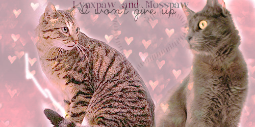
TEXT !?: LESSON 3
well i was wrong. the second lesson was long lol.
hopefully this one won't be too long. this lesson
is going to be on how to not make text the main
focus.
1. adding in text into any banner is a difficult
task, especially when you don't want it to be the
main focus. the best thing to do, in my opinion,
is to first make the graphic and then add in the
text. that is as long as you just want the text to
be on top of the graphic. if you want it to blend
in with the graphic, then you should write it
before you finish the actual graphics. but for
this lesson, we are going to stick with the former:
putting the text on after you have finished your
graphic.
2. the main thing you should think about when
adding in text is what do you want the text to
project? even though you don't want it to be the
main focus, the text should still have some idea
or concept behind it. the will help you with the
placement, color, etc.
3. once you've though of a theme behind your text,
you can start thinking about size and placement.
you don't want the text to be too small so that no
one can see it but not too big that it takes over the
whole graphic. generally the main text is larger
while the subtext is smaller. in terms of placement,
the main text usually goes on top of the subtext.
but then again that also depends on the theme
behind your text and what you want the looker
to see first. i generally put my main text on top
and my subtext below.
4. now before i continue with placement, i want
to touch upon color and font style. color is also
such a difficult topic. an important thing to
remember is that the color should match the
graphic you are making. if everything is a
shade of blue, don't make the font orange.
unless you have the color orange somewhere.
black and white are exception colors but besides
that, try to make the colours match and fit. for
font style, i just keep it simple for the main text,
either choosing georgia or tahoma. then for the
subtext i use a fancy font like french script.
sometimes, however, that doesn't work. if your
whole graphic is about darkness and evil, try
to find an "evil" font, like vampire or something
so that it fits the graphic. dafont.com has such
amazing fonts! you should check it out :]
5. now back to placement. placing text on your
graphic is important. i recommend to not place
your text on any model. it becomes difficult to
read and sometimes the text can block out a
piece of the model. keep the text around the
area of focus just because you don't want lookers
to not even pay attention to your text. the sig i
have is a good example. the text isn't that
noticeable but it's still part of the main focus.
6. TIP: try saving the image as an xcf file because
then you can still edit it. you can save it as a png/
jpeg files as well but you can't edit those after you
close the file
Stars Example that she did in 5 minutes so it's UBER bad
